

Pie plot showing the percentage of samples belonging to each variable selected at the right panel.
Table containing the information of all samples from the selected dataset.
Select a dataset and a gene at the left panel to generate a boxplot with the expression value in case and control samples.
Boxplot showing the beta-values for each CpG site in case and control samples.
Lineplot comparing the mean methylation values in case and control samples.
Plot showing the relationship between expression and methylation. Each point represents a sample. X axis represents the expression value of the gene and Y axis the mean methylation value of the selected CpGs sites.
Heatmap showing expression correlation among genes. Select a dataset, a condition and at least 2 genes at the left panel.
1. Select datasets
Click the datasets to be included in the analysis. Use the left buttons to select groups of datasets
Automatic selection
2. Select genes
Paste your genes or select a predefined module (Chaussabel et al., Immunity. 2008)
3. Heatmap
Heatmap with the Fold Change of each selected dataset and gene.
Show covariates
Clustering
Sort datasets by
FDR filter
Heatmap representing the expression values of top differentially expressed genes. Different filters and other parameters can be set at the right panel.
Results of KEGG pathways enrichment analysis. Download the table clicking the below button. Click the last column plots to open an interactive window with the genes colored by Fold Change.
Download table
Results of signal transduction analysis. Click the below button to open an interactive report.
Results of CARNIVAL analysis. Click the below button to open an interactive report.
1. Select datasets
Click the datasets to be included in the analysis. Use the left buttons to select groups of datasets
Automatic selection
2. Run Meta-Analysis
Rank Product analysis to find common deregulated genes based on Fold Changes. This analysis can take some minutes to complete.
Select datasets and click 'Prepare data' button
1. INTRODUCTION
ADEx (Autoimmune Diseases Explorer) is a database for easy exploration and analysis of expression and methylation data from a large collection of autoimmune diseases (ADs) studies. We included data from case-control experiments for systemic lupus erythematosus (SLE), rheumatoid arthritis (RA), Sjögren’s syndrome (SjS) systemic sclerosis (SSc) and type 1 diabetes (T1D).
2. DATA SOURCE
All data included in ADEx has been obtained from the public repository NCBI-GEO [1]. We manually curated each dataset to obtain homogeneous expression, methylation and clinical data. In addition, we split those datasets containing samples from more than one disease/tissue/cell type or platform (e.g. GSE110169 was split into GSE110169 SLE and GSE110169 RA). Table 1 contains information for all the included datasets.
Table 1. Datasets available in ADEx.
3. USING ADEx
You can change between different levels of data analysis by clicking on the different tabs at the top of the page (Figure 1). Inside each section there are different tabs at the left to select a specific kind of analysis into the chosen category.

Figure 1. ADEx tabs
In the following sections each tab and subtab are explained.
3.1. Data overview
Information about the available datasets can be found in both pie plot or table formats in this section. In 'Plot' tab, quantitative information is provided regarding the clinical and phenotype information. In 'Table' tab, information about the sample phenotype and their data origin is provided. All this information has been extracted from GEO or from the associated published articles whenever supplied. This information can be presented individually for each dataset, or grouped by disease. When a single dataset is being explored, the experiment summary is shown at the top. Users can use this section to identify datasets of their interest to be analyzed in the following sections.
In this subsection a pie chart is generated showing the distribution of samples in the selected dataset(s) (Figure 2). Samples are grouped by the variable selected at the right panel. A summary table is located below the plot.
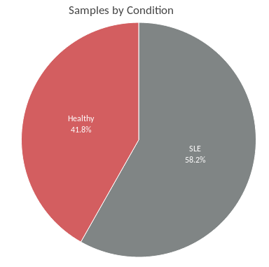
Figure 2: Pie chart
3.1.2. TableHere there is an interactive table with the available information for each sample from the selected dataset(s). Samples can be ordered by any column and there is a searcher on the top-right of the table. Click on GSM, GSE or GPL identifiers to check information available in GEO.
3.2. Gene Query
This section was created in order to explore the expression and methylation of a specific gene, or the correlation between them, within a single dataset. Users can explore the different gene expression values for each dataset comparing case and control samples with a boxplot. Meanwhile, methylation data is presented at CpG level, so that users can select a region of the gene (e.g. promoter) and the mean methylation value for cases and controls is plotted for every CpG probe contained in the selected region. It has been demonstrated the strong relationship of gene expression and methylation levels [2]. That is why in this section, users can also integrate both, expression and methylation values to search for direct or inverse correlations. Finally, gene expression correlation analysis can be performed in order to get insight into the relationship between different genes and to find groups of coexpressed genes.
A boxplot with the expression values in each condition. On the top of the plot there is the P-value of Wilcoxon's test between conditions, showing the evidence of differential expression.
3.2.2. MethylationAt the top of this page, you can select the region of the gene to plot methylation values (Figure 3). You can automatically select the promoter, the gene body or the promoter and gene body clicking on the corresponding buttons.
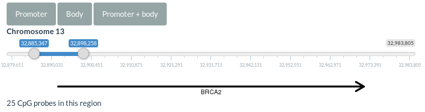
Figure 3. Region selector for methylation data
A boxplot and a lineplot are generated in this section showing the methylation values for each CpG site within the selected region. These plots can be scaled by the CpGs' genomic positions checking the corresponding option at the right panel.
3.2.3. Expression & MethylationHere you can integrate expression and methylation data for the datasets containing these two kinds of data. A correlation plot is generated. Each point of the plot represents the expression of a sample on the y-axis and the mean methylation value of all the CpGs into the selected region of a sample on the x-axis. Correlation method and regression line can be controlled in the right panel.
3.2.4. Expression correlationIn this analysis, correlation between all the selected genes are plotted. Genes are clustered in order to get groups of correlated genes (Figure 4).
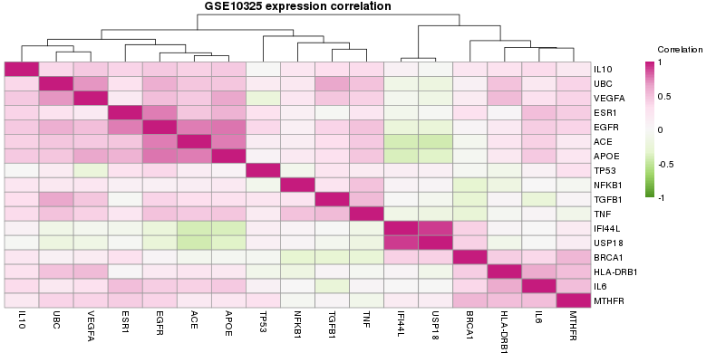
Figure 4. Correlation plot
3.3. Gene Set Query
In this section users can explore a gene set expression across several datasets. Gene sets can be defined by the user or selected among a list of coexpressed modules defined by Chaussabel et al. [3]. The results are plotted in a heatmap showing the log2 FC for each gene and dataset. 3 steps are necessary to perform this analysis (Figure 5):
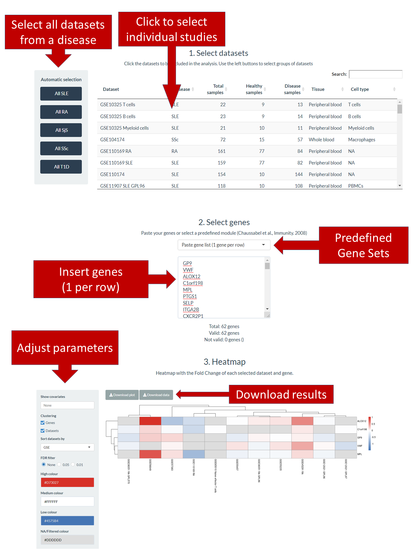
Figure 5. Gene Set Query section.
An interactive table shows the information of all expression datasets available in ADEx. Click on the rows to select datasets. In addition, you can use the buttons at the left to directly select all datasets from a disease.
Step 2. Select genesYou can enter a list of genes to the box (one line per gene) or select a predefined gene set to autocomplete the box. Below the box there is information about how many genes are included, how many of them have a valid name and which are the ones with no valid names.
Step 3. HeatmapOnce datasets and genes are selected, a heatmap will be automatically generated. Use the left panel to control which information should contain the plot, activate or deactivate clustering of genes and datasets, the datasets sorting criteria (if clustering is off) and colors selection. Use the buttons at the top of the heatmap to download the publication-quality plot and to download the data used to generate it.
3.4. Analyze Dataset
In this section, different analysis can be performed for a whole dataset.
Differential expression analysis comparing disease and control samples is performed using limma package [4]. By default, a heatmap with the expression of the top 50 differentially expressed genes (DEGs) sorted by adjusted P-Value by False Discovery Rate (FDR) is displayed. It is also possible to sort them by Log2 Fold-Change and FDR. Cutoffs can be applied to both statistics. Both ordering metric and top genes can be specified at the right panel. Colors in the heatmap are assigned based on the expression values scaled in each gene. Use the buttons at the right panel to download the table and the plot.
3.3.2. Pathway analysisThese results are precomputed using all the DEGs that have an FDR value below 0.05. A table gathers the significantly enriched KEGG [5] pathways along with their associated hypergeometric test statistics and an interactive plot shows detailed information of the participant genes in the pathway colored according to their FC. Plots on the last column can be clicked to open a new window with a full-size interactive plot.
3.3.3. Signal transductionBeyond conventional pathway enrichment methods, we have implemented more sophisticated mechanistic models of cell signaling activity which have demonstrated to be very sensitive in deciphering disease mechanisms [6,7] as well as the mechanisms of action of drugs [8,9]. To offer this functionality we have applied HiPathia software [7] to gene expression data. This method estimates changes in the activity of signaling circuits defined into different pathways. With this approach, it becomes possible to study in detail the specific signaling circuits altered in ADs within the different signaling pathways. We precomputed this analysis for each dataset and the results are available as tables and interactive reports. Click on “Open interactive report” button to open a new window with an interactive report, where different pathways and circuits can be dynamically visualized (Figure 6).
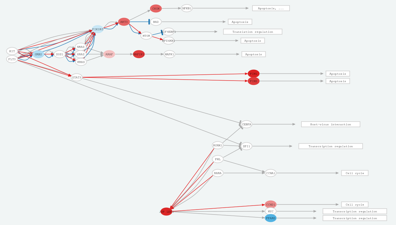
Figure 6. Signal transduction report.
3.3.4. Causal networksWe analysed the expression datasets to identify upstream regulatory signaling pathways deregulated in autoimmune diseases. For that aim, we used CARNIVAL [10], a software that uses transcription factors and pathways activities to identify the networks topologies. The results are available as tables and interactive reports. Click on “Open interactive report” button to open a new window with an interactive report, where different networks can be dynamically visualized
3.5. Meta-analysis
ADEx also implements meta-analysis functionalities based on gene expression data to integrate and jointly analyze different and heterogeneous datasets in order to search for biomarkers and common gene signatures from the same or different pathologies [11]. Meta-analysis is based on the FCs of each dataset and gene. Rank Product algorithm [12] is applied in order to select the most coherent deregulated genes in the selected datasets. There are 3 steps in this section, similar to Gene Set Query analysis:
Click on the datasets directly at the table or use the left buttons to automatically select all datasets from a disease.
Step 2. Launch Meta-AnalysisOnce you selected datasets, click the Launch button and wait some moments. When the meta-analysis finishes, you can select other datasets and perform another meta-analysis clicking the same button.
Step 3. ResultsWhen meta-analysis is performed a heatmap appears automatically. You can set some parameters at the left panel and download the results clicking the top buttons.
3.6. Download data
Here you can select one or more datasets and download the processed expression/methylation data as a text file. Select datasets at the table and click 'Prepare data' button below. Once the data is ready, click 'Download' button to get a compressed folder with all the requested datasets.
4. F.A.Q.
Q: Can I submit my own data to ADEx?A: Currently there is not such feature. However, if you think that your data should be in ADEx, contact us and we will include it as soon as possible.
Q: How do I cite ADEx?A: You should cite both the original studies which generated tha data you used and ADEx itself.
Q: Are you planning to include more datasets/diseases/omics...?A: Our intention is to update constantly the available data and analyses. However, if you miss something important, you can write us to priorize it.
5. News
Version 1.0.0 (2019-10-08)6. REFERENCES
- Edgar R, Domrachev M & Lash AE (2002). Gene Expression Omnibus: NCBI gene expression and hybridization array data repository. Nucleic Acids Research, 30(1):207-10
- Suzuki MM & Bird A (2008). DNA methylation landscapes: provocative insights from epigenomics. Nat. Rev. Genet. 9, 465–476
- Chaussabel D et al. (2008). A modular analysis framework for blood genomics studies: application to systemic lupus erythematosus. Immunity 29, 150–164
- Ritchie ME et al. (2015). limma powers differential expression analyses for RNA-sequencing and microarray studies. Nucleic Acids Research, 43(7): e47
- Kanehisa M & Goto S (2000). KEGG: kyoto encyclopedia of genes and genomes. Nucleic Acids Res. 28, 27–30
- Cubuk C et al. (2017). Gene Expression Integration into Pathway Modules Reveals a Pan-Cancer Metabolic Landscape. Cancer Res. 78, 6059–6072
- Hidalgo MR et al. (2017). High throughput estimation of functional cell activities reveals disease mechanisms and predicts relevant clinical outcomes. Oncotarget, 3(8), 5160–5178
- Amadoz A et al. (2015). Using activation status of signaling pathways as mechanism-based biomarkers to predict drug sensitivity. Sci. Rep. 5, 18494
- Esteban-Medina M et al. (2019). Exploring the druggable space around the Fanconi anemia pathway using machine learning and mechanistic models. BMC Bioinformatics 20, 370
- Liu A et al. (2019).From expression footprints to causal pathways: contextualizing large signaling networks with CARNIVAL. npj Systems Biology and Applications 5, 40
- Toro-Domínguez D, Carmona-Sáez, P & Alarcón-Riquelme, ME (2014). Shared signatures between rheumatoid arthritis, systemic lupus erythematosus and Sjögren’s syndrome uncovered through gene expression meta-analysis. Arthritis Res. Ther. 16
- Del Carratore F et al. (2017). RankProd 2.0: a refactored bioconductor package for detecting differentially expressed features in molecular profiling datasets. Bioinformatics, 33(17), 2774-2775
7. CONTACT
If you have any doubt, question or suggestion, you can write us to jordi.martorell@genyo.es .
If you use ADEx, please include this reference:
Jordi Martorell-Marugán, Raúl López-Dominguez, Adrián García-Moreno, et al. (2021) A comprehensive database for integrated analysis of omics data in autoimmune diseases BMC Bioinformatics. 22, 343, https://doi.org/10.1186/s12859-021-04268-4
Supported by: